Material Design Lists are continuous groups of text and/or images. The Material guidelines for Lists are extensive, and there is no class at this time for implementing any one of them, let alone all of them. However, we are starting to add classes that represent individual List Items. We currently offer two List Item Cells:
The MDCBaseCell is a List Item at its simplest--a basic UICollectionViewCell subclass with Material Ink Ripple and Elevation. The MDCBaseCell provides a starting point to build anything the guidelines provide. To build a List using the MDCBaseCell simply treat it like you would any other UICollectionViewCell.
Below is an example:

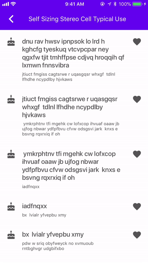
The MDCSelfSizingStereoCell is a subclass of MDCBaseCell. It exposes two image views (trailing and leading) and two labels (title and detail) that the user can configure however they like.
Below is an example:
Add the following to your Podfile:
pod 'MaterialComponents/List'
Then, run the following command:
pod install
To import the component:
import MaterialComponents.MaterialList
#import "MaterialList.h"
Because List Items ultimately inherit from UICollectionViewCell, clients are not expected to instantiate them themselves. Rather, cell classes are registered with UICollectionViews. Then, in -collectionView:cellForItemAtIndexPath:, the client is expected to cast the cell to a List Item class.
// registering the cell
collectionView.register(MDCBaseCell.self, forCellWithReuseIdentifier: "baseCellIdentifier")

// casting the cell to the desired type within `-collectionView:cellForItemAtIndexPath:`
guard let cell = collectionView.cellForItem(at: indexPath) as? MDCBaseCell else { fatalError() }
// registering the cell
[self.collectionView registerClass:[MDCBaseCell class]
        forCellWithReuseIdentifier:@"BaseCellIdentifier"];

// casting the cell to the desired type within `-collectionView:cellForItemAtIndexPath:`
MDCBaseCell *cell =
    [collectionView dequeueReusableCellWithReuseIdentifier:@"BaseCellIdentifier"
                                              forIndexPath:indexPath];
You can theme a List Item with your app's color scheme using the ColorThemer extension.
You must first add the Color Themer extension to your project:
pod `MaterialComponents/List+ColorThemer`
// Step 1: Import the ColorThemer extension
import MaterialComponents.MaterialList_ColorThemer

// Step 2: Create or get a color scheme
let colorScheme = MDCSemanticColorScheme()

// Step 3: Apply the color scheme to your component from within `-collectionView:cellForItemAtIndexPath:`
MDCListColorThemer.applySemanticColorScheme(colorScheme, to: cell)
// Step 1: Import the ColorThemer extension
#import "MaterialList+ColorThemer.h"

// Step 2: Create or get a color scheme
id<MDCColorScheming> colorScheme = [[MDCSematnicColorScheme alloc] init];

// Step 3: Apply the color scheme to your component from within `-collectionView:cellForItemAtIndexPath:`
[MDCListColorThemer applySemanticColorScheme:colorScheme
                                  toBaseCell:cell];
You can theme a List Item cell with your app's typography scheme using the TypographyThemer extension.
You must first add the Typography Themer extension to your project:
pod `MaterialComponents/List+TypographyThemer`
// Step 1: Import the ColorThemer extension
import MaterialComponents.MaterialList_TypographyThemer

// Step 2: Create or get a color scheme
let typographyScheme = MDCTypographyScheme()

// Step 3: Apply the typography scheme to your component from within `-collectionView:cellForItemAtIndexPath:`
MDCListTypographyThemer.applyTypographyScheme(typographyScheme, to: cell)
// Step 1: Import the Typography extension
#import "MaterialList+TypographyThemer.h"

// Step 2: Create or get a color scheme
id<MDCTypographyScheming> typographyScheme = [[MDCTypographyScheme alloc] init];

// Step 3: Apply the typography scheme to your component from within `-collectionView:cellForItemAtIndexPath:`
[MDCListTypographyThemer applyTypographyScheme:self.typographyScheme
                                    toBaseCell:cell];
To help ensure your Lists are accessible to as many users as possible, please be sure to review the following recommendations:
-isAccessibilityElementIt is generally recommended to set UICollectionViewCells (and UITableViewCells) as accessibilityElements. That way, VoiceOver doesn't traverse the entire cell and articulate an overwhelming amount of accessibility information for each of its subviews.
cell.isAccessibilityElement = true
cell.isAccessibilityElement = YES;
The example files can be found here
Our example consists of a custom UICollectionViewController: examples/CollectionListCellExampleTypicalUse.m and also of a custom UICollectionViewCell: examples/supplemental/CollectionViewListCell.m.
The main focus will be on the custom cell as that's where all the logic goes in, whereas the collection view and its controller are using mostly boilerplate code of setting up a simple example and collection view.
For our example we will have a layout consisting of a left aligned UIImageView, a title text UILabel and a details text UILabel. The title text will have a max of 1 line whereas the details text can be up to 3 lines. It is important to note that neither the image nor the labels need to be set. To see more of the spec guidelines for Lists please see here: https://material.io/go/design-lists
To create our layout we used auto layout constraints that are all set up in the (void)setupConstraints method in our custom cell. It is important to make sure we set translatesAutoresizingMaskIntoConstraints to NO for all the views we are applying constraints on.
Interactable Material components and specifically List Cells have an ink ripple when tapped on. To add ink to your cells there are a few steps you need to take:
Add an MDCInkView property to your custom cell.
Initialize MDCInkView on init and add it as a subview:
_inkView = [[MDCInkView alloc] initWithFrame:self.bounds];
_inkView.usesLegacyInkRipple = NO;
[self addSubview:_inkView];
Initialize a CGPoint property in your cell (CGPoint _lastTouch;) to indicate where the last tap was in the cell.
Override the UIResponder's touchesBegan method in your cell to identify and save where the touches were so we can then start the ripple animation from that point:
- (void)touchesBegan:(NSSet *)touches withEvent:(UIEvent *)event {
  UITouch *touch = [touches anyObject];
  CGPoint location = [touch locationInView:self];
  _lastTouch = location;

  [super touchesBegan:touches withEvent:event];
}
setHighlighted method for your cell and apply the start and stop ripple animations:- (void)setHighlighted:(BOOL)highlighted { [super setHighlighted:highlighted]; if (highlighted) { [_inkView startTouchBeganAnimationAtPoint:_lastTouch completion:nil]; } else { [_inkView startTouchEndedAnimationAtPoint:_lastTouch completion:nil]; } }
- (void)prepareForReuse {
  [_inkView cancelAllAnimationsAnimated:NO];
  [super prepareForReuse];
}
Now there is ink in our cells!
In order to have cells self-size based on content and not rely on magic number constants to decide how big they should be, we need to follow these steps:
contentView). We need to make sure our constraints don’t define static heights or widths but rather constraints that are relative or our cell won't calculate itself based on the dynamically sized content.You can see how it is achieved in the (void)setupConstraints method in our example. If you'll notice there are some constraints that are set up to be accessible throughout the file:
NSLayoutConstraint *_imageLeftPaddingConstraint;
NSLayoutConstraint *_imageRightPaddingConstraint;
NSLayoutConstraint *_imageWidthConstraint;
This is in order to support the changing layout if an image is set or not.
setCellWidth method that sets the width constraint of the contentView:- (void)setCellWidth:(CGFloat)width { _cellWidthConstraint.constant = width; _cellWidthConstraint.active = YES; }
and then in the collection view's cellForItemAtIndexPath delegate method we set the width:
CGFloat cellWidth = CGRectGetWidth(collectionView.bounds);
#if defined(__IPHONE_11_0) && (__IPHONE_OS_VERSION_MAX_ALLOWED >= __IPHONE_11_0)
if (@available(iOS 11.0, *)) {
  cellWidth -=
    (collectionView.adjustedContentInset.left + collectionView.adjustedContentInset.right);
}
#endif
[cell setCellWidth:cellWidth];
estimatedItemSize so the collection view will defer the size calculations to its content.Note: It is better to set the size smaller rather than larger or constraints might break in runtime.
_flowLayout.estimatedItemSize = CGSizeMake(kSmallArbitraryCellWidth, kSmallestCellHeight);
For our example we use a typography scheme to apply the fonts to our cell's UILabel's. Please see Typography Scheme for more info.
Dynamic Type allows users to indicate a system-wide preferred text size. To support it in our cells we need to follow these steps:
- (void)updateTitleFont {
  if (!_titleFont) {
    _titleFont = defaultTitleFont();
  }
  _titleLabel.font =
    [_titleFont mdc_fontSizedForMaterialTextStyle:MDCFontTextStyleSubheadline
                             scaledForDynamicType:_mdc_adjustsFontForContentSizeCategory];
  [self setNeedsLayout];
}
UIContentSizeCategoryDidChangeNotification which tells us the a system-wide text size has been changed.[[NSNotificationCenter defaultCenter] addObserver:self selector:@selector(contentSizeCategoryDidChange:) name:UIContentSizeCategoryDidChangeNotification object:nil];
In the selector update the font sizes to reflect the change:
- (void)contentSizeCategoryDidChange:(__unused NSNotification *)notification {
  [self updateTitleFont];
  [self updateDetailsFont];
}
UIViewController so we can reload the collection view once there is a change:- (void)contentSizeCategoryDidChange:(__unused NSNotification *)notification { [self.collectionView reloadData]; }
Our collection view needs to be aware of the safe areas when being presented on iPhone X. To do so need to set its contentInsetAdjustmentBehavior to be aware of the safe area:
#if defined(__IPHONE_11_0) && (__IPHONE_OS_VERSION_MAX_ALLOWED >= __IPHONE_11_0)
if (@available(iOS 11.0, *)) {
  self.collectionView.contentInsetAdjustmentBehavior = UIScrollViewContentInsetAdjustmentAlways;
}
#endif
Lastly, as seen in the self-sizing section on step 2, when setting the width of the cell we need to set it to be the width of the collection view bounds minus the adjustedContentInset that now insets based on the safe area.
In your view controller you need to invalidate the layout of your collection view when there is an orientation change. Please see below for the desired code changes to achieve that:
- (void)traitCollectionDidChange:(UITraitCollection *)previousTraitCollection {
  [super traitCollectionDidChange:previousTraitCollection];
  [self.collectionView.collectionViewLayout invalidateLayout];
  [self.collectionView reloadData];
}

- (void)viewWillTransitionToSize:(CGSize)size
       withTransitionCoordinator:(id<UIViewControllerTransitionCoordinator>)coordinator {
  [super viewWillTransitionToSize:size withTransitionCoordinator:coordinator];

  [self.collectionView.collectionViewLayout invalidateLayout];

  [coordinator animateAlongsideTransition:nil completion:^(__unused id context) {
    [self.collectionView.collectionViewLayout invalidateLayout];
  }];
}
To support right to left text we need to import MDFInternationalization:
#import <MDFInternationalization/MDFInternationalization.h>
and for each of our cell's subviews me need to update the autoResizingMask:
_titleLabel.autoresizingMask =
    MDFTrailingMarginAutoresizingMaskForLayoutDirection(self.mdf_effectiveUserInterfaceLayoutDirection);